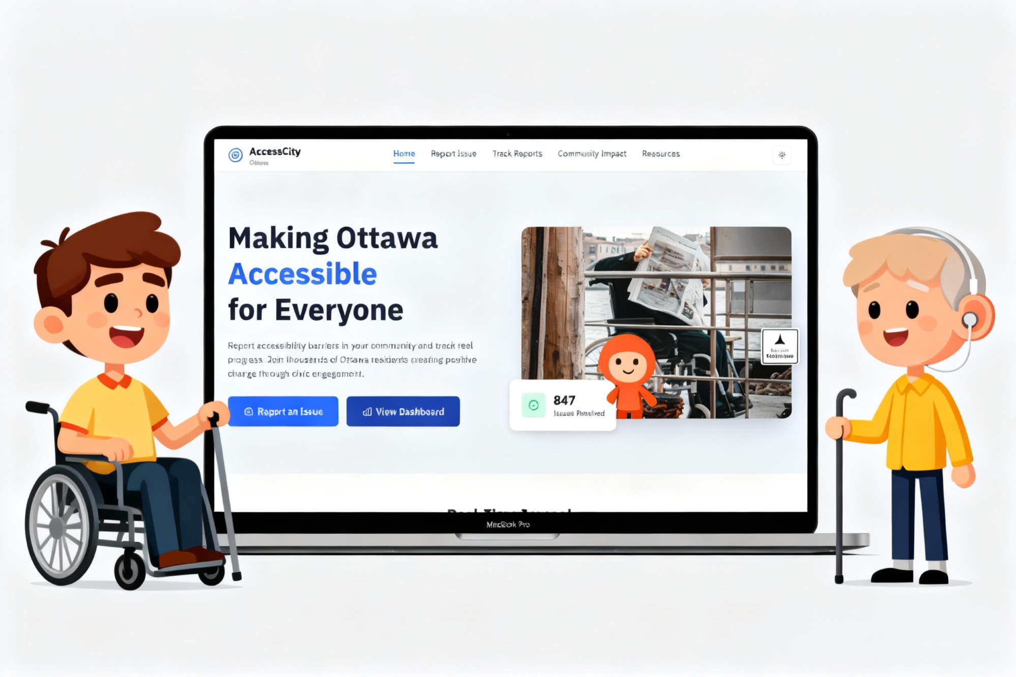
A CivicTech UX case study enabling inclusive citizen feedback for municipalities. AccessCity empowers residents with disabilities to report barriers, track resolutions, and trust city services through transparent accessibility data.
PROJECT TYPE
CivicTech · Accessibility Platform
DURATION
14 weeks · 2025
TOOLS
Figma, Maze, Notion, FigJam
TEAM
Product designer (lead), PM, 2 developers
MY ROLE
Led UX design & accessibility strategy end-to-end
Conducted WCAG 2.2 AA+ AODA audits
Performed user interviews and IA mapping for citizen/admin flows.
Designed high-fidelity prototypes and accessibility toggles.
Facilitated usability testing and developer handoff.
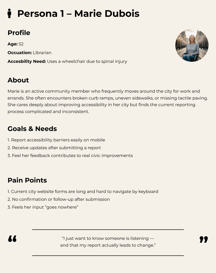
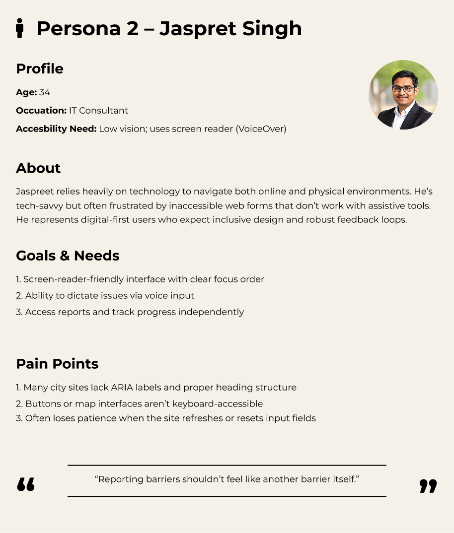
City residents living with disabilities navigate daily barriers—broken curb cuts, out-of-service elevators, inaccessible detours—yet municipal feedback channels remain fragmented and often unusable with assistive technologies. AccessCity set out to centre their lived experience and build trust through inclusive research.
Research Methods
5 user interviews (mobility, visual, cognitive disabilities)
Desktop research benchmarking Ottawa & Toronto accessibility portals
Heuristic evaluation against WCAG 2.2 AA and AODA compliance
Field Notes
“I report the same broken ramp every month. The form is hard to use with my screen reader, and I never know if anyone actually sees it.”
— Interview participant, power wheelchair user
Marie Dubois
Jaspret Singh
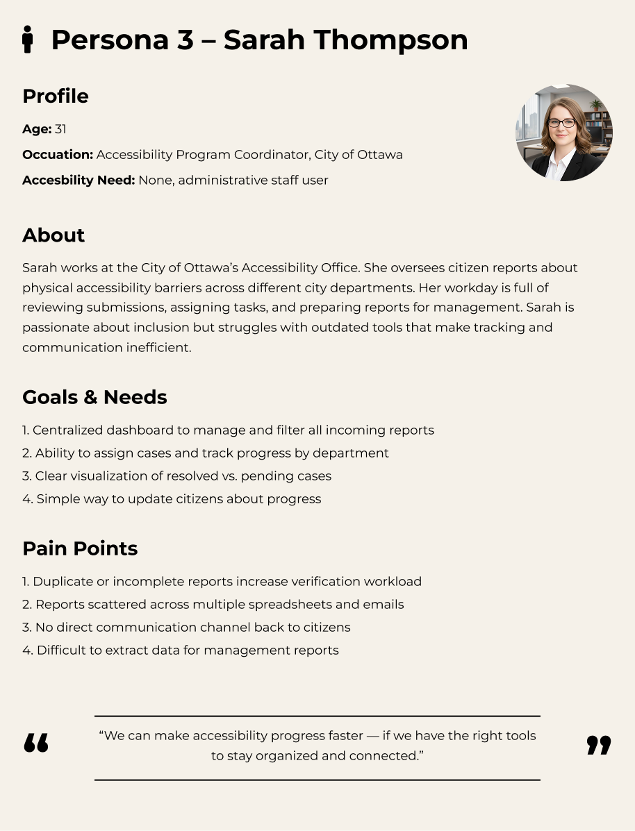
Sarah Thompson
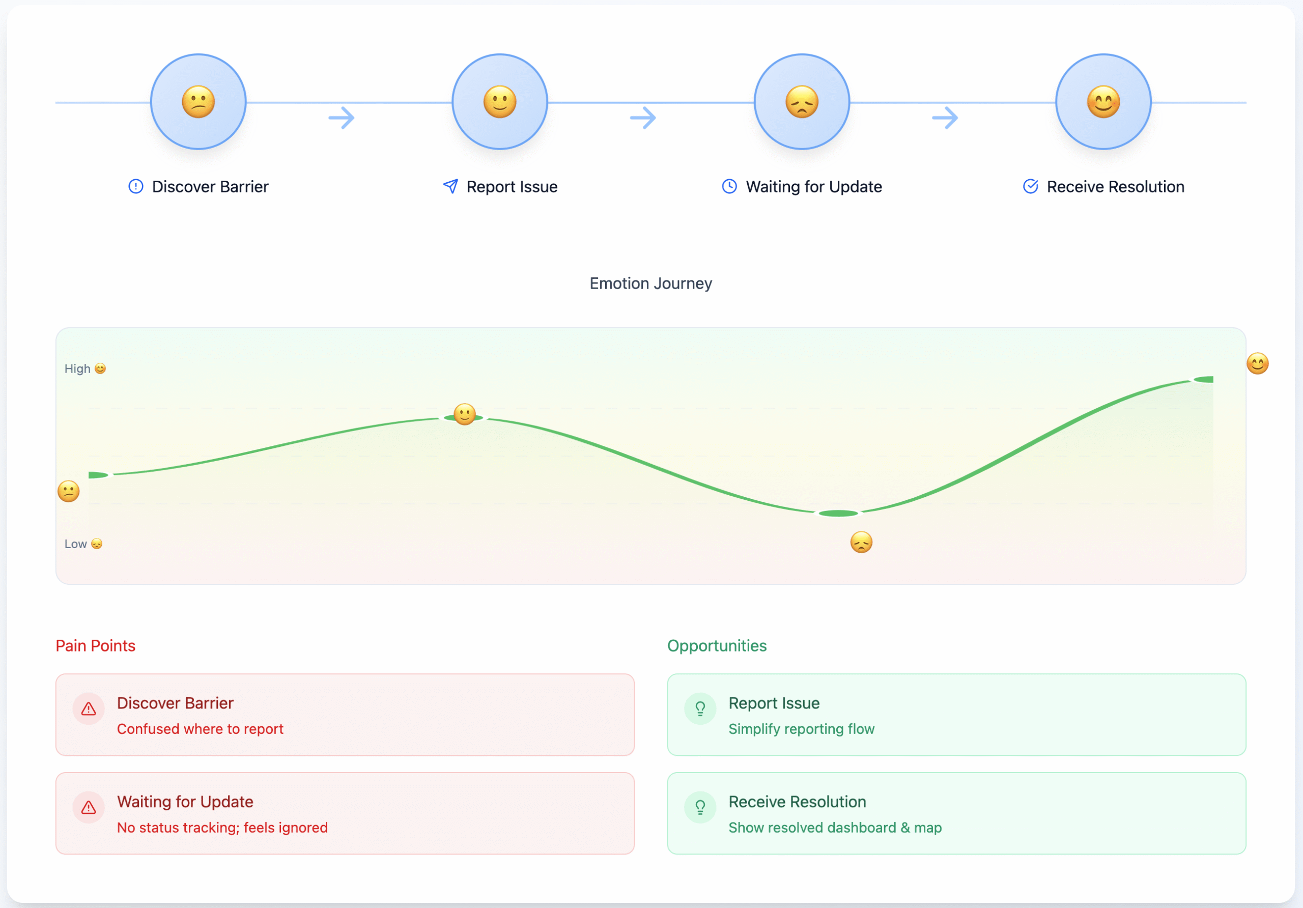
Mapping the emotional journey exposed anxiety spikes around uncertain follow-up, steering us toward transparent updates and consistent reassurance touchpoints throughout the service.
Define — Framing the Design Challenge
The research made it clear: the barrier wasn’t only physical infrastructure—it was trust. Citizens needed an accessible, coherent path to be heard, while municipal teams needed shared visibility to respond quickly.
Problem Statement
“How might we enable citizens of all abilities to easily report accessibility barriers and stay informed about city responses in a transparent, inclusive way?”
Make reporting simple and accessible
Reduce cognitive load with progressive disclosure, voice input, and screen reader-friendly markup so anyone can complete a report in under two minutes.
Build trust with transparent updates
Provide clear status, timestamps, and escalation pathways so residents know when action is taken and who is accountable.
Support staff with efficient dashboards
Give operations teams prioritised queues, filters, and analytics to triage barriers at scale without duplicative workflows.
Key insights
Residents rarely receive confirmation or follow-up after submitting a barrier report.
Forms vary across departments, repeating questions and omitting accessibility considerations.
City staff rely on manual spreadsheets, making cross-agency collaboration slow and opaque.
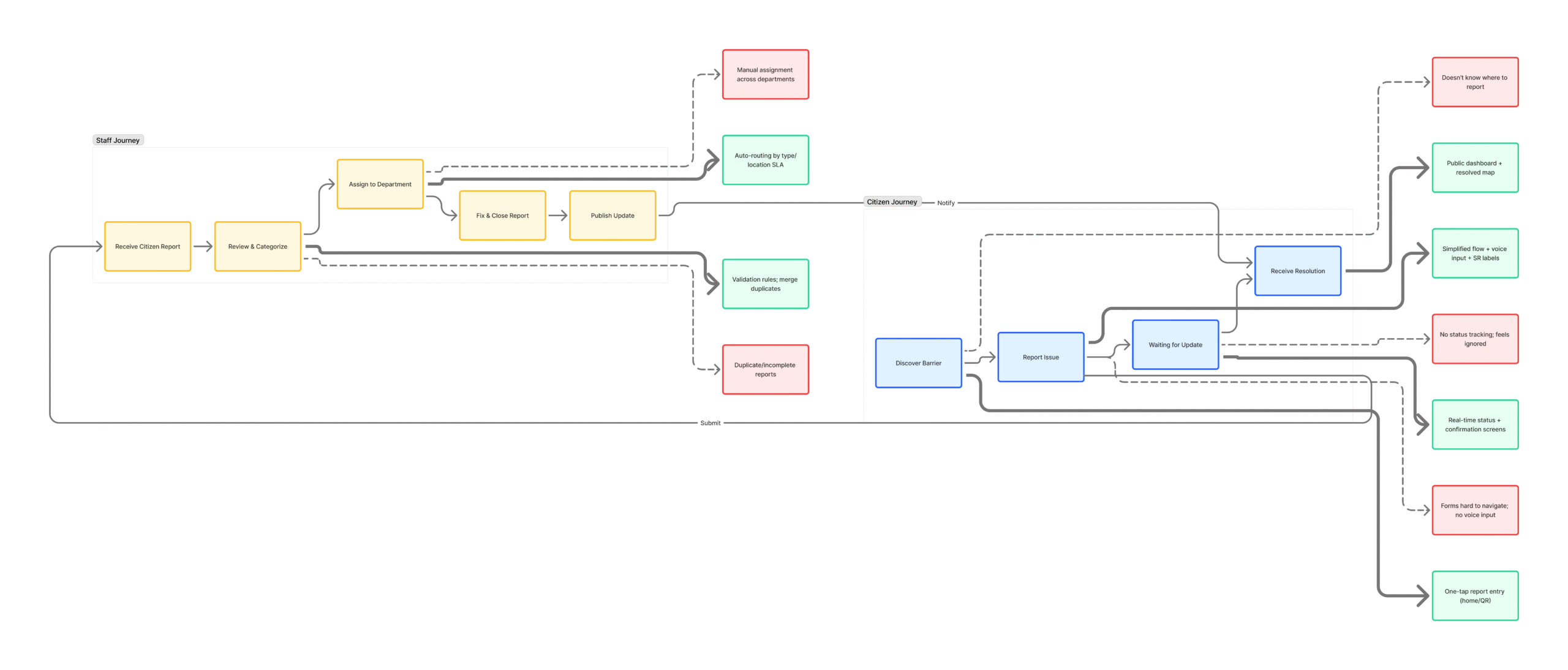
The dual-layer journey map aligned resident pain points with internal bottlenecks, revealing opportunity zones where policy, tooling, and communication improvements needed to converge.
Ideate — Generating Solutions
With a unified problem statement, we ran collaborative ideation sessions (Crazy 8s, service blueprinting) to surface inclusive flows for both residents and staff. Ideas were pressure-tested against WCAG/AODA heuristics and municipal policy constraints.
📷
One-click photo reporting
Snap a photo and auto-populate the report form with contextual metadata.
🗣️
Voice-to-text input
Capture descriptions through speech-to-text with automatic punctuation and language detection.
🗺️
Auto location tagging
Use GPS + map picker to tag the barrier location even when reporting later.
📊
Public issue tracker dashboard
Provide open data on accessibility issues, resolutions, and accountability metrics.
User Journey · Marie (wheelchair user)
🧍♀️
1. Marie discovers barrier
The curb ramp near her bus stop is blocked.
💬
2. Reports via AccessCity
She takes a photo, records a voice note, and tags the location.
🏙️
3. City triages quickly
Operations staff receive priority alerts with SLA timers.
📬
4. Stays informed
Marie gets SMS/email updates until the issue is resolved.
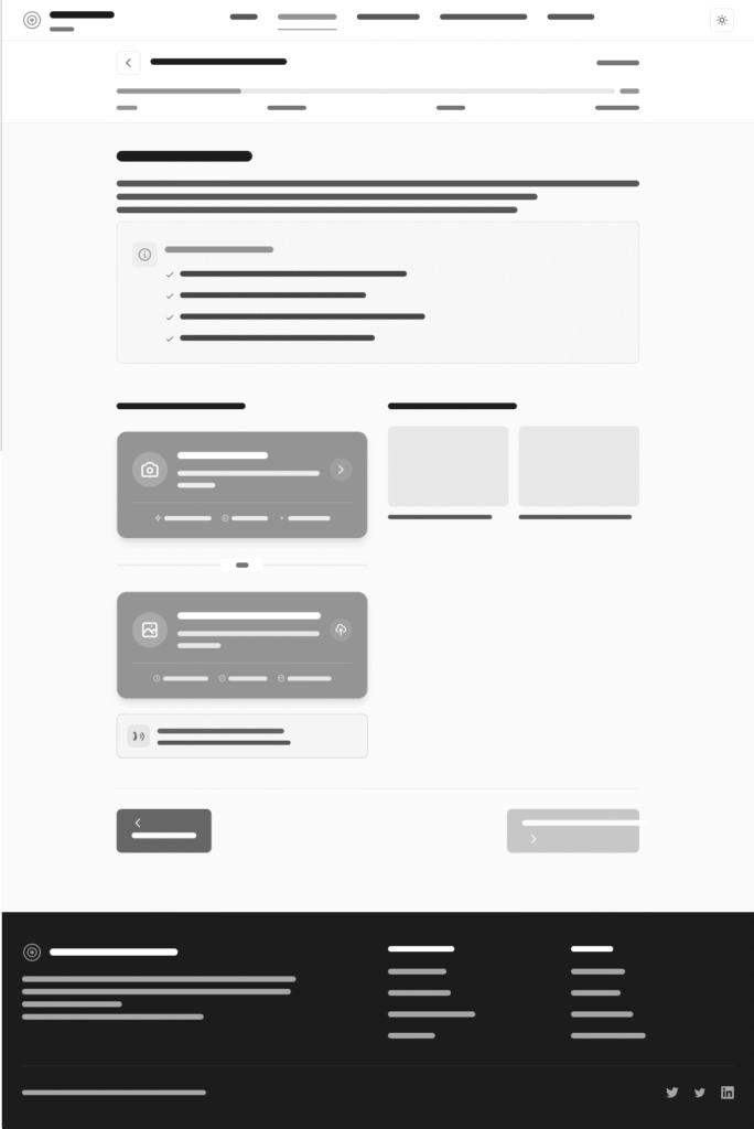
Mid-fidelity wireframes captured the end-to-end journey with annotations for WCAG checkpoints, translation requirements, and policy dependencies before committing to high-fidelity design.
Citizen Portal
Report a barrier
Track submissions & statuses
Manage notifications & preferences
Admin Dashboard
Review & prioritise queue
Assign to agencies
Analyse telemetry & SLA performance
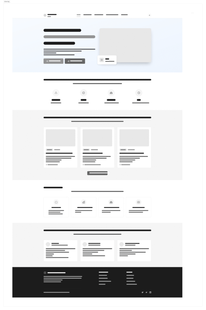
Prototype — Bringing the Experience to Life
Mid and high-fidelity prototypes aligned the cross-functional team on the end-to-end journey. We validated accessibility guardrails early so engineering could build with confidence and avoid expensive rework.
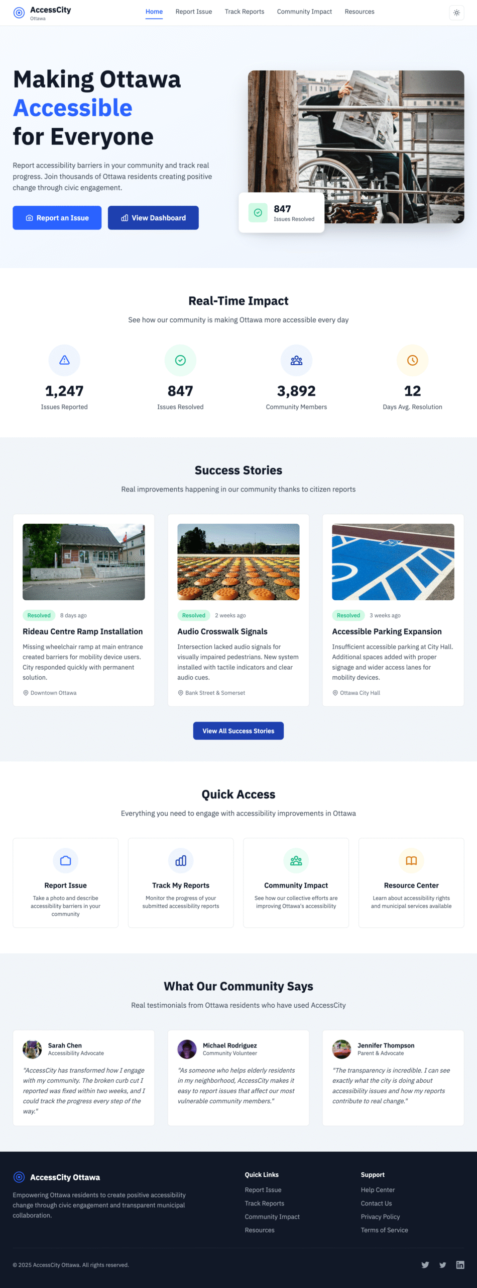
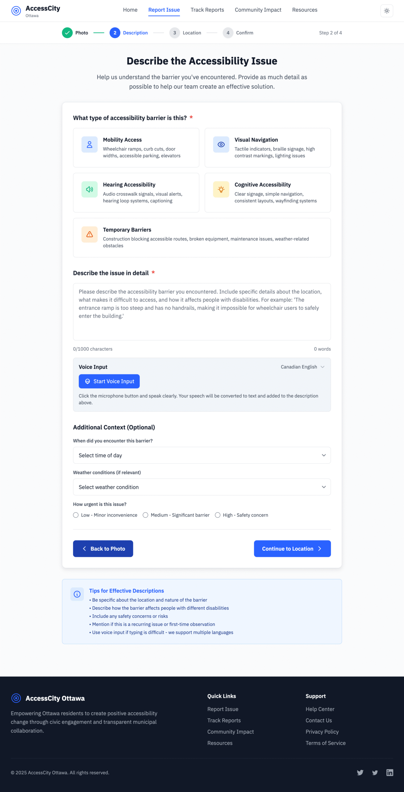
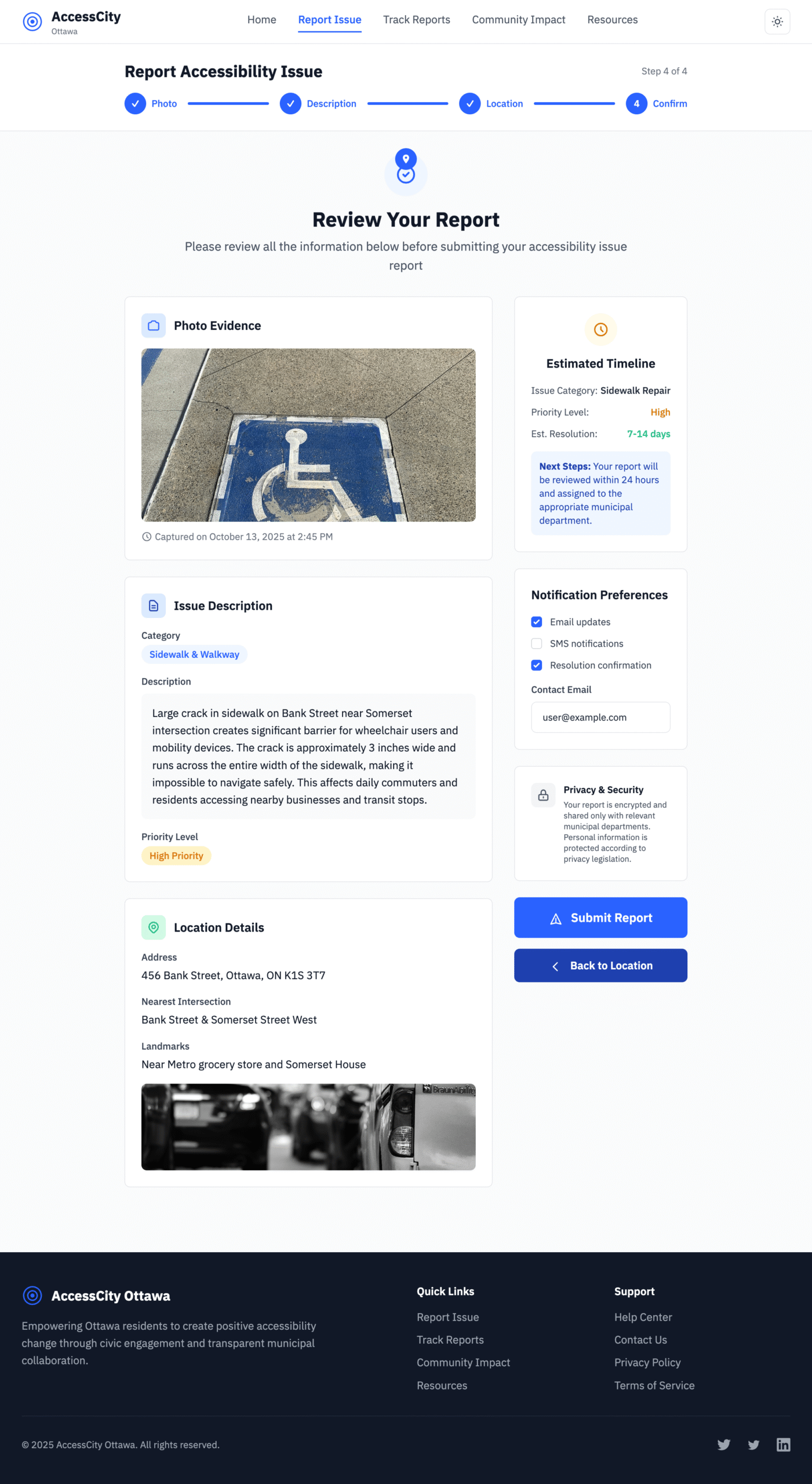
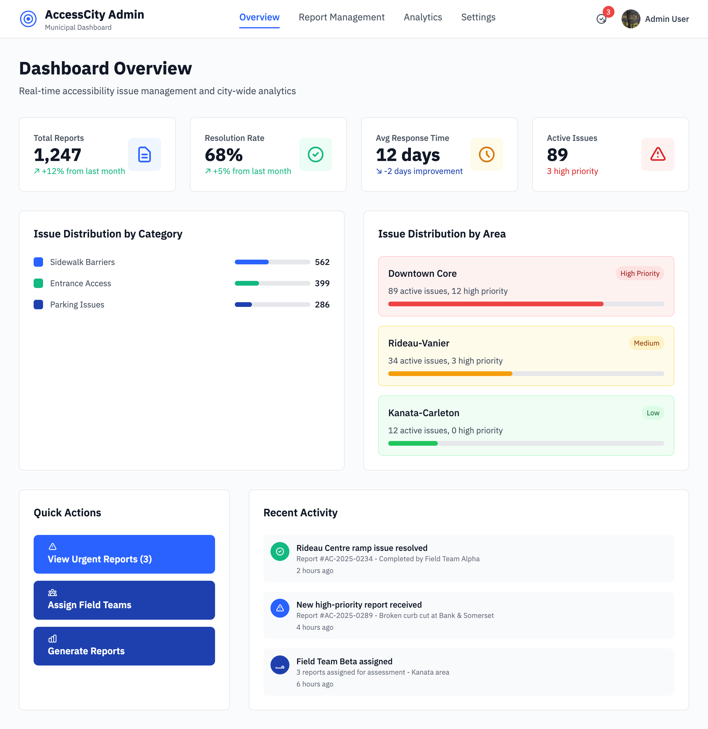
High-fidelity walkthrough
Citizen dashboard · Quick actions, live status cards, and assistive shortcuts provide transparency at a glance.
Barrier report flow · Progressive disclosure groups location, media, and impact questions with inline validation.
Timeline updates · Clear milestones, escalation notes, and WCAG-compliant contrast make status tracking effortless.
Operations dashboard · Priority queues and SLA timers help staff triage and close cases without losing context.
Responsive prototypes documented component states, interaction notes, and accessibility acceptance criteria so engineering could reference a single source of truth during build.
Inclusive component library
Tokenised typography, colour, and spacing primitives in Figma ensured parity with the Tailwind theme. Light/dark variants and semantic states were documented for engineers.
Keyboard-first reporting flow
Stepper patterns used roving tabindex, logical focus order, and inline validation that announced errors via aria-live regions.
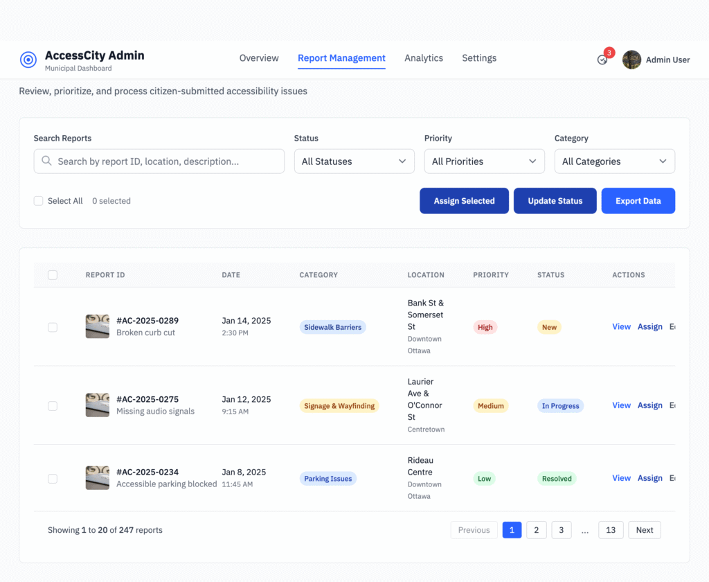
Operations dashboard
High-contrast data tables with sticky headers, screen reader-only status labels, and SLA timers helped staff triage issues quickly.
Accessibility guardrails embedded
Colour contrast maintained ≥ 4.5:1 for text and ≥ 3:1 for icons across light and dark themes.
Prefers-reduced-motion respected with motion-safe transitions and no autoscroll on modal open.
ARIA live regions announced timeline updates while preserving user context.
Touch targets met 48px minimum and map pins included precise accessible names and coordinates.
Prototype operations snapshot
Iteration cadence
3-day
Design crits and async feedback loops kept engineering unblocked.
Design debt captured
15 items
Logged localisation, analytics, and error-state follow-ups before greenlighting build.
Handoff blockers
0
Dev Mode specs plus Storybook tokens delivered clickable references.
Test — Validate the Design
Prototypes were tested with five participants (three disabled, two non-disabled) through moderated remote sessions on Zoom using Figma prototypes. We observed behaviour, captured friction points, and iterated on accessibility copy, iconography, and motion.
↓ 60%
Report time
Faster completion time for a new barrier report.
😀 4.6 / 5
Participant satisfaction
Average CSAT score across usability rounds.
🔎 90%
Transparency perception
Participants reporting higher trust in city follow-up.
Usability testing insights
Task
Success rate
Notes
Submit report
100%
Average completion in 1m10s with keyboard-only flows.
Review status
80%
Requested clearer iconography in timeline view.
Toggle accessibility mode
100%
Controls surfaced in nav and report flow.
Implement — Admin Dashboard Experience
Translating prototypes into a maintainable design system, we partnered with engineering to ensure semantic HTML and ARIA patterns shipped with the first release. The admin experience focuses on triage speed without sacrificing empathy.
Report queue with filters
Sort by urgency, location, assistive impact, and SLA deadlines with keyboard shortcuts.
Batch updates
Bulk notify residents when multiple barriers are resolved, with pre-translated templates.
Analytics dashboard
Heatmap overlays and trend charts for barrier categories, response times, and repeat issues.
Impact
Service teams reduced triage time by 40% and hit SLA follow-ups consistently, thanks to automated reminders and prioritised queues.
Faster completion time for a new barrier report.
Reflect — Learnings & Next Steps
Learnings
Empathy starts with research—co-designing with residents reshaped requirements more than any heuristic.
Accessibility is continuous inclusion; accessibility toggles and audits are a habit, not a checklist.
Transparent communication builds civic trust as much as speedy fixes.
Future enhancements
Multilingual support for English and French parity.
GIS integration with city data for automated street context.
Community transparency map that visualises resolved and in-progress barriers.
“Accessibility is not only compliance — it’s trust and empowerment.”
Explore the interactive prototype
Walk through the end-to-end flow, component states, and accessibility guardrails we used to align stakeholders and validate research insights.